
Mastering the Art of Newsletter Layouts
Crafting a snazzy newsletter? It’s like whipping up the perfect cocktail—part flair, part precision, all wow. The design isn’t just eye candy; it’s the trusty engine keeping readers glued and your message loud and clear. Whether you’re a Brevo buff, ConvertKit connoisseur, or MailerLite maestro, your email’s layout is your ace up the sleeve.
Why Care About Newsletter Layout?
Reader Magnetism:
A slick layout? It’s like a riveting novel—keeps folks flipping the pages. Mix images and text to guide readers right where you want ’em.
Brand Harmony:
Think of your newsletter as your brand’s face. Keep it consistent with colors and fonts, and your readers will start recognizing you in a flash.
CTA Magic:
CTAs are like road signs. Plonk them right, and your readers will be zooming on those clicks and conversions.
What Makes a Knockout Newsletter Layout?
Killer Header:
Your header’s like a book cover—it better be good! Use punchy headlines to reel ’em in.
Visual Flow:
Guide those peepers with headings, lists, and pics. No one likes a wall of text, right?
Mobile Savvy:
More folks are checking emails on phones these days. So, make sure your layout’s a smooth operator on all screens.
Space to Breathe:
Don’t cram it all in. Give your content some room to stretch out—makes it easier on the eyes.
Top Templates for Brevo, ConvertKit, and MailerLite
Brevo’s Best:
Minimalist Chic: Keep it sleek with simple lines and let your images do the talking.
Bold Statements: Bring on the colors for those ‘look at me’ moments.
ConvertKit’s Cool Picks:
Content-Driven: Got tons to say? This one’s got your back with space for articles and vids.
Event Promotion: Get folks to your shindig with dates and RSVP buttons front and center.
MailerLite’s Marvels:
E-commerce Spotlight: Show off those products with style and a nudge to buy.
Newsletter Digest: Keep it balanced with a mix of text and pic for regular updates.
Tips to Jazz Up Your Newsletter Engagement
Personal Touch:
Add little nuggets like names or places to make it feel like you’re chatting just to them.
Brand Consistency:
Stick to your color palette and fonts to make your newsletters unmistakably yours.
A/B Fun:
Experiment with different setups. Test out which headlines, colors, or CTA spots get the most love.
Keep Tabs with Analytics:
Use analytics like your personal spyglass. See how folks interact and tweak for better results.
Why Your Newsletter Layout Matters
Every email you send is a mini experience for your reader. A clear, optimized layout ensures your audience can absorb information quickly without feeling overwhelmed. A cluttered newsletter with too much text or poor formatting can make subscribers click away — even if your content is valuable. Newsletter design isn’t about fancy visuals; it’s about clarity and flow. A good layout guides the reader’s eyes through your most important messages and calls to action. In tools like Brevo or MailerLite, a structured layout helps ensure your emails are responsive across devices — a key factor since most subscribers read emails on mobile.The Anatomy of a High-Performing Newsletter Layout
A well-optimized layout balances content hierarchy, design flow, and visual focus. Regardless of the tool you use, these principles apply universally.
| Section | Purpose | Best Practices |
|---|---|---|
| Header | Captures attention and reinforces brand identity. | Include logo, navigation, and preview text. |
| Hero Image or Headline | Draws readers into your main story or offer. | Use concise text and one clear image that reflects your message. |
| Body Content | Delivers the core message — news, tips, or offers. | Break into short paragraphs, use bullet points, and maintain white space. |
| Call to Action (CTA) | Encourages the desired next step. | Use strong, visible buttons; place one primary CTA above the fold. |
| Footer | Closes the loop with contact details or social links. | Keep it minimal — logo, unsubscribe link, and key icons. |
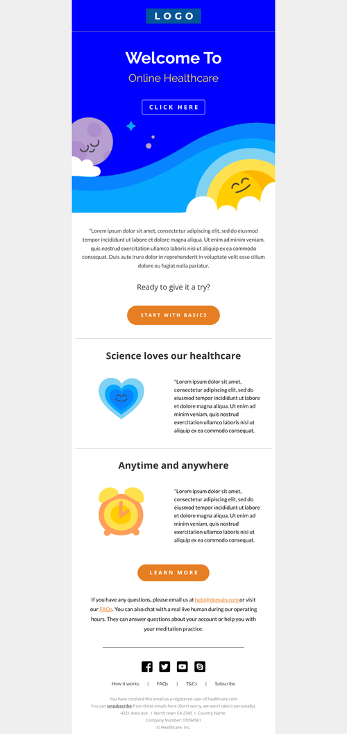
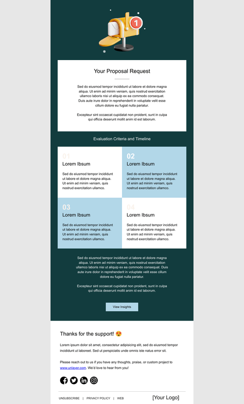
Newsletter Layouts Optimized for Brevo
Brevo’s email builder makes layout design effortless. It includes responsive templates and a drag-and-drop editor that helps marketers create clean, consistent newsletters without technical skills. Here’s what makes Brevo layouts stand out:
| Layout Feature | Description | How It Boosts Engagement |
|---|---|---|
| Grid System | Prebuilt columns ensure perfect alignment and spacing. | Makes your newsletter look organized and professional. |
| Responsive Blocks | Each section adjusts automatically to mobile or desktop. | Ensures flawless readability across devices. |
| Reusable Components | Save headers, footers, or CTAs for future use. | Saves time and keeps branding consistent. |
| Automation Compatibility | Every layout can be inserted into automated workflows. | Connects design with audience behavior seamlessly. |
Watch: How to Design Engaging Newsletters in Brevo A step-by-step tutorial showing how to use Brevo’s builder to create responsive, high-performing newsletter layouts.
Layouts for ConvertKit and MailerLite
While Brevo excels in automation and CRM integration, other email tools like ConvertKit and MailerLite bring their own strengths. Let’s compare how they approach newsletter design and structure.
| Platform | Layout Focus | Strengths | Ideal For |
|---|---|---|---|
| ConvertKit | Minimalist and content-first layouts. | Simple, authentic feel that builds connection with readers. | Creators, writers, and educators. |
| MailerLite | Modern, design-driven layouts with flexibility. | Dynamic content blocks, drag-and-drop, and visual storytelling. | Bloggers, freelancers, and nonprofits. |
| Brevo | Automation-friendly and brand-consistent layouts. | Integrates CRM data and segmentation for personalized experiences. | Marketers, small businesses, and agencies. |
Design Principles for Awesome Newsletter Layouts
Ever felt like your newsletter just ain’t clicking with folks? No worries. Here’s a little secret: it’s all in the design magic. Let’s sprinkle some of that on your newsletters so they pop and sizzle with every read.
Go Solo with a Single-Column Layout
Why do single-column layouts rock? Picture this: most people catchin’ up on emails while sipping morning joe, phone in one hand. A single column keeps things smooth and easy, like butter on toast. No awkward scrolling or squinting needed.
Color Me Impressed
Think of colors as your newsletter’s mood ring. Stick to two or three that vibe with your brand, and you’re golden. It’s like wearing your favorite outfit that makes you feel invincible. These colors will highlight important bits, like headings and action buttons, making them pop like fireworks on the Fourth of July.
White Space is Your Best Friend
Ah, white space. It’s like pauses in a good convo, giving everything room to breathe. It lets readers relax and soak in the info without feeling overwhelmed. So, sprinkle it around generously—it’s like giving your text and images a comfy bed to lie on.
Match Your Visuals with Your Words
You know when a picture says a thousand words? Well, in newsletters, it should say the right thousand. Every image should play nice with your text, telling the same story. It’s like having a dance partner who knows all your moves—it just clicks.
Keep It Crystal Clear
Let’s face it, nobody likes a cluttered space. Keep your text bite-sized and your calls to action focused. It’s like leading a dance—guide your readers to the main attractions without stepping on their toes. This way, they know exactly where to go and what to do next.
So there you have it! A few tricks to transform your newsletters from “meh” to “wow!” By making them not just pretty, but reader-friendly too, you’ll have your audience clicking, engaging, and coming back for more. And hey, if you’re ready to take things up a notch, Brevo’s got your back. With their tools, you’ll whip up stunning, device-friendly newsletters faster than you can say, “Sign me up!”
Remember, it’s all about making your message heard without shouting. So go on, give these a whirl and watch your engagement soar. And hey, don’t forget to have a little fun while you’re at it!
Sign Up for Brevo
Testing and Optimizing Your Layout
Once your newsletter is live, optimization begins. Each send offers valuable data on what readers prefer. Use built-in analytics from your platform to test variations in design, tone, and placement.- A/B test CTAs: Try different button colors and positions.
- Measure engagement: Track open, click, and scroll rates.
- Experiment with headers: Visual vs. text-based headlines can produce different results.
- Review mobile performance: Over 60% of emails are opened on mobile devices.
- Iterate: Update underperforming sections regularly.
Further Resources for Newsletter Design
- Free Template Library — Download optimized email layouts.
- Email Marketing Strategies — Learn how to write and structure campaigns effectively.
- Step-by-Step Tutorials — Follow our guides to master Brevo integrations.
- HubSpot Newsletter Examples
- Global Email Design Statistics
Affiliate Transparency
Some links in this article are affiliate links. If you sign up through them, ZenFix Academy may earn a small commission at no additional cost to you. Learn more at our Affiliate Disclosure.Faq’S
You might be thinking about how to design newsletters that look clean, perform well, and display perfectly on every device. The key is using optimized layouts built for tools like Brevo and other top email platforms that balance design, readability, and engagement.
01 Why does newsletter layout design matter so much?
A good layout improves how readers engage with your content. It helps your message flow naturally, keeps attention longer, and makes it easy for subscribers to find key information and click your links.
02 What makes a newsletter layout optimized for Brevo?
Optimized layouts in Brevo are responsive, lightweight, and structured with clear sections for headlines, images, and CTAs. They ensure your emails look professional on desktop and mobile without formatting issues.
03 Can I use the same newsletter layout in other tools like MailerLite or ConvertKit?
Yes. Most modern email platforms support similar block-based structures. You can import or recreate your design easily while keeping fonts, spacing, and colors consistent across tools.
04 How often should I update my newsletter layout?
It’s a good idea to review your layout every few months. As your audience grows, small design adjustments — like cleaner sections or new CTA placements — can help maintain engagement and freshness.